N.B.: This piece was originally published on the now-defunct No Escape. I was compelled to post it here both for the purpose of preservation and because its subject matter was brought to mind for me when viewing the videos of Any Austin (such as one on the original Halo, entitled, “The loneliness of empty Halo maps”), who has a variety of uploads granularly exploring videogame sites.
Something which makes architecture so exciting, and attempts at describing it potentially a considerable challenge, is that it produces in us feelings for which there is often no term, or even sentence, precise enough; yet it is a craft of high creative and ocular precision. At times it can seem that poetry of a sort is one’s only recourse. When abstractions on high fail, or are inappropriate to the situation, our other option may be to seize onto the details, and to name what we can see with strict specificity. Names give us a point among countless others to grab onto.
But how to describe, really, the way a stretch of wall recedes? the height of an archway? the situating of some windows relative to the floor? We could measure each of these things, perhaps saying this and that about proportionality and the human body as a metric; but even then we would, I think, find ourselves at a loss for what the total composition stirs in us. Looking at a niche designed by Michelangelo, one architectural historian remarked that “its intensity of feeling defies technical description.” Sometimes we would do best to say nothing at all.
Space forms a fabric of the ineffable. There is a tantalizing parallel to be found between how we can presume to observe the totality of a space yet never grasp the sources of its fullest invocational powers; and how the vast majority of the universe remains unobservable. It can, at times, seem almost as if the more we advance the more a thing recedes. The designs of John Soane, many of which were illustrated by Joseph Michael Gandy, express a peculiar fascination with this dynamic, wherein space appears to kaleidoscopically retreat into itself and take an introverted pleasure in this. A watercolor of Gandy’s from 1832, showing a Freemasons’ hall in London, depicts this to great crepuscular and sepulchral effect.
We may recall that, once, the word mystery described a secret rite. To engage in such rites was to make contact with the ineffable. A most beautiful distinction of sacred buildings extending from our Mediterranean-born religions, and those of countries nearby, remains their enrichment by architectonic forms which, in their multiplicity and extent, create an impression of that-which-lays-beyond: strange shapes and apertures meeting amongst shadows and exceeding direct observation, recalling ancient worshipful days within caves. The sterilizing and history-breaking impulses of modernity have at times forgotten this value.
Gavin Macrae-Gibson, in The Secret Life of Buildings, makes reference to the figures populating G. B. Piranesi’s grotesque (and perhaps, by now, fatigued by citation) prints of imaginary prisons — those carceri d’invenzione — by quoting historian Colin Rowe: “…there is nothing final about any of their possible relationships.” One could read this according to the modern tradition’s theme of fragmentation, a prediction of industrial secular society’s alienation of the individual from their work and others. I prefer to interpret this from the angle of what mystery is: that which does not lead us to a final unveiling and instead brings our attention to a magnum mysterium from which all constellated experience flows. Finality is tacit yet infinitely distant.
Piranesi’s persons inhabit a mystery, as does our avatar in Dark Souls, whose world we engage as if entering a torchlit network of occult imagination. But I mention the carceri specifically because our reason for being attracted to them is not obvious. Although mysterious, they are also grim. Most would say they are brutal before beautiful, infernal (or purgatorial) before heavenly. The meme mocking people who enjoy the cyberpunk genre for its setting of a techno-corporate hellscape — “WOW!! COOL FUTURE!!” a basic fool exclaims — misses a point much more interesting than any dime-a-dozen comment on capitalism: that the exploration of a well-crafted nightmare will always hold more allure than that of a strange-but-happy dream.
The fact will not be lost on some readers here that Dark Souls begins with our person locked within a cell among a remote asylum. Although this avatar soon escapes the cell, the rest of our journey, as player-actors, is one of a kind of self-imprisonment wherein we subject ourselves to anxiety and toil for the sake of the experience. Even if the difficulty of Dark Souls has been overstated in terms of intensity and topicality, such that examining it with lucidity now comprises a textual challenge, it is still pertinent, for that enclosure constituting our delightful prison is its level design, without which the challenge would largely not exist.
This dimension of hard design, wherein enemies and environment work in concert to oppose us, is one dimension of Dark Souls‘ spaces. Another — the one that interests me here — is these spaces’ arrangements taken as formal organisms, and their evocative qualities, associational or not. I mean to limit my sight to the particular: a portion, perhaps just a room, from an entire environment. Elements of hard design might be mentioned, but these are not the focus.
Why does one spot stand out from another, especially when there may be nothing visually splendid about the one? For some, the answer could, on occasion, have to do with familiarity. The culture of “dueling,” or “fight clubs,” which organically grew out of Dark Souls‘ player base, meant that participants would spend hours upon hours hanging out in designated zones. For many of these people, I imagine that a square in the Undead Burg or a stretch of the Darkroot Garden evokes a subsequent fondness resembling one’s regard for a childhood playground — a fondness maybe all the warmer now that the online scene therein has cooled to a chill.
How oddly human that we can learn to have affection for such antagonistic and cheerless places. Here, in some miniature and finite way, is a positive model of eternal recurrence: through the passage of time, a vicarious avatar coming to admiringly know the shape and pattern of every fine and mundane and brutal thing, and through this achieving mastery over endless cyclicality. Who could love a place like Sen’s Fortress except the very person it was designed to crush?
In the end, my appreciation here tends to be of a relatively passive sort — less about the action prompted by this or that obstacle, or the sheer time spent here or there, and more about reflective looking, of leading my person’s body around and taking in my surroundings as ambient sculpture. Despite never having played Overwatch, I understand what Josh Trevett means when, for a Haywire Magazine article, he opined that the game’s later inclusion of the ability to just sit down is “even better than a fresh balance pass or a new map or a character reveal.” Dark Souls lacks this animation (Bloodborne would introduce it, and Dark Souls 3 would provide even more like it); yet the game’s unusual slowness of player movement — slower, I would add, than that of its forebear, Demon’s Souls —, if not encourages, at least complements this absorption of one’s environment, rather than its voracious consumption, as the majority of modern videogames do with their hyperactive, hoverpad-like speed of play.
So, let’s slow things down. Let’s dare to tarry.
Join me as we look at six of my favorite Dark Souls sites.
Blighttown: Blowdart Snipers’ Hangout
With a powerfully ugly imperfection, Blighttown represents to me Hidetaka Miyazaki and company’s commitment to thorny ideas, even when this commitment conflicts with an industrial and audient demand for “polish.” A less-than-ideal framerate has haunted Blighttown’s appraisals since the game’s release, which only relented a bit after the 2018 re-release. Alongside the Tomb of the Giants, Blighttown is so offensive a monstrosity of level design — a derivational explosion of Demon’s Souls‘ shocking mess, the Valley of Defilement — that it amazes to know it ever found its way into what came to be such a popular piece of media. A grimy and baffling hell of posts, planks, pots, torches, and ladders, all slung against a bastion’s base, it provides one with ample opportunities not only to see how much further down one must go before reaching a poisonous mud-swamp, but also for one to make a fatal slip-and-fall.
All of this is the main theme of Blighttown’s upper portion. As we descend, we briefly enter and exit a few wide and circular shafts of gray-green pallor. It is by such a structure, the largest of those visible, that we first plunge into Blighttown. The rest are accessed through shattered walls. While these shafts appear bottomless, the termination of one ensues lower Blighttown’s bonfire and opens out onto the sludge. This is upper Blighttown’s sub-theme: the suggestion of a preexisting, vast, and selectively navigable sewer system, now interpenetrated by scaffolding. Nothing else in Dark Souls feels as forlorn to me as these little sections do. They recall the subterranean flood control tunnels of the Kasukabe reservoir; or, in retrospect, the scrapped version of Dark Souls 2‘s Gutter, which appears to have built upon this tunnel-like motif.
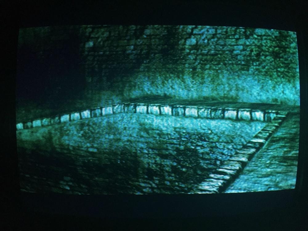
If one thought that Blighttown was done with precariousness at descent’s end, they’ll be thrown for a loop to find that an ascent, via another series of structures, is required for exit. Halfway along this ascent, a yawning archway, built into the cliffside, admits optional entry. Here again is that ghoulish stonework, but now comprising a whole recessed chamber with a narrow upper walkway and a declining lower level, respectively populated by blowdart snipers and fire-breathing canines — man above, beast below. With its geometrically simple evocation of King’s Field IV or the first Shadow Tower, and the contrast between upper and lower level when, navigating the latter, we are enclosed by high walls of wight-green, this room is further memorable to me for its locked and impenetrable iron-bar door and nearby corpse, slumped on the other side of a barred cloaca. These details further suggest that, yes, right beyond lies a world of waste- and water-stained cavities, once wandered by some poor souls in wondrous misery.
Anor Londo: Chapel with Titanite Demon
Game developer and writer Garth Margaris has observed, “Spatial positioning, rather than dodges or counters, is at the heart of many NES games and at the heart of Dark Souls combat.” The first time we encounter a Titanite Demon, it is in the crypt of the church on whose middle story the blacksmith Andre of Astora has set up shop. Slightly spotted by the remains of ruined columns, the crypt is open enough to allow us to figure out the enormous Titanite Demon’s movement and attacks without much spatial complication. The situating of every Titanite Demon afterwards is highly uncomfortable: visibility is diminished and/or room for maneuvering is dramatically constricted, or, as is the case with the four demons inhabiting the bottom of Sen’s Fortress, the ground’s sticky tar-like substance limits our movement.
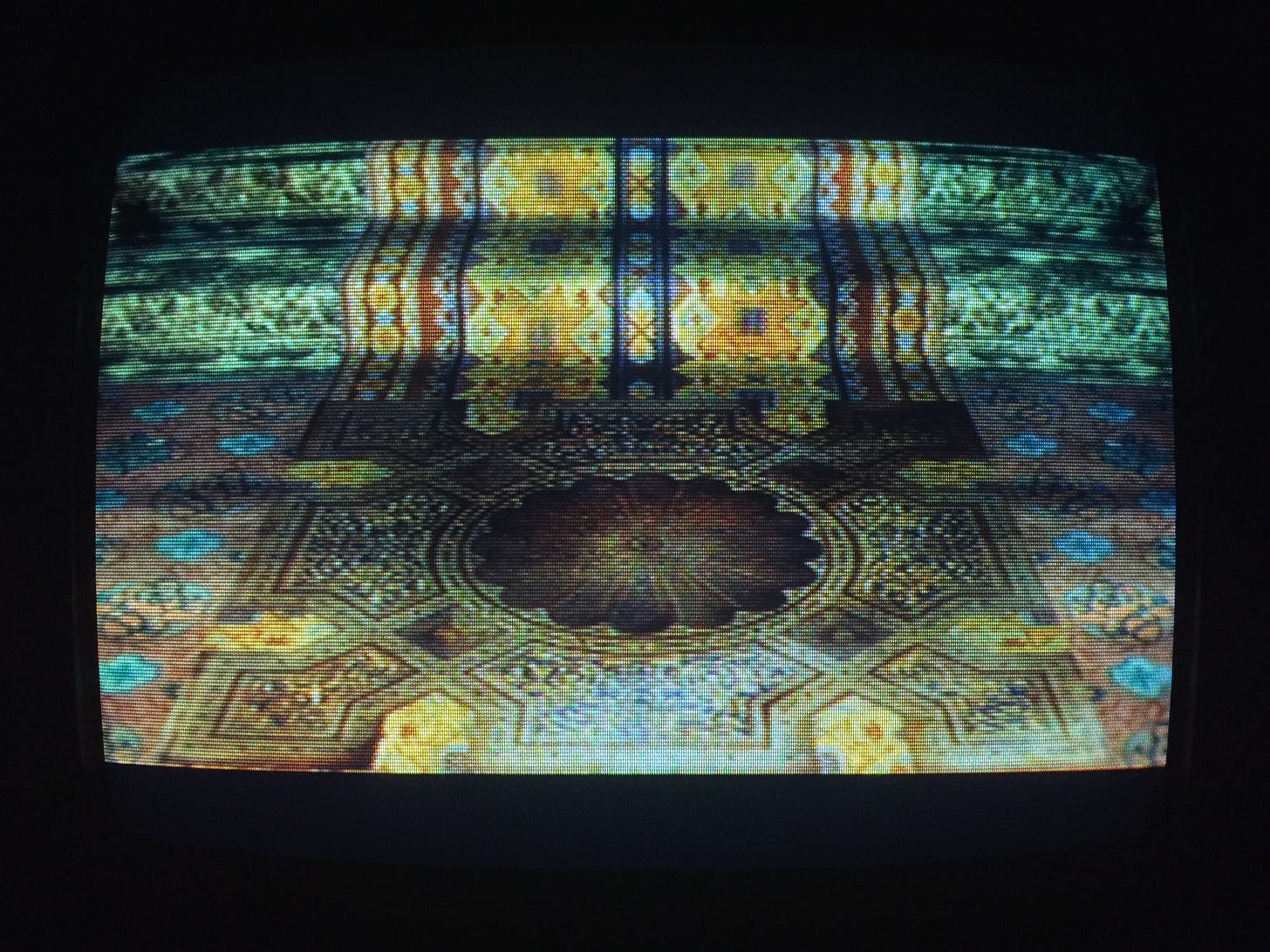
Finding the Titanite Demons in the Catacombs and Anor Londo are both memorable surprises that stand out from others in-game, the former for much of our approach obscured by an intense darkness, the latter occupying a small side-room whose upper floor we may have traversed prior and the baluster of which we might’ve not bothered to look over. Anor Londo’s instance, although not the most performatively demanding, is the most exciting to me for its striking of a bizarre note: fighting for one’s life against a black-bodied monstrosity among a high-ceiling room of severely formal, cream-colored neoclassicism. Absent Gwyndolin’s solar illusion, with the room doused in aquamarine moonlight, the bizarreness turns dreamy-dark, especially with the vividly colored and patterned carpeting gracing our feet.
Demon Ruins: Igneous Bed with Taurus Demons
William Blake despised decomposition and glorified the individuality of form — the bounding line. “The great and golden rule of art, as well as of life, is this: That the more distinct, sharp, and wirey the bounding line, the more perfect the work of art…” The figures of his visual art bring to mind Assyrian reliefs and statues, resplendent in taut form, well-controlled musculature, and firm orientation. Deprived of outline, “all is chaos again.” A similar principle is at play in Dark Souls‘ world and its critical reception. As we go lower and lower — beneath Blighttown’s swamp, to the Demon Ruins, then to Lost Izalith, maybe finally to the Ash Lake — space explodes and sprawls. Gone, to many people’s announced displeasure, is the tight and dense level design of preceding locations. I understand this displeasure. A place like the sunken Darkroot Basin would seem to fulfill any pre-release worries over Dark Souls‘ switch from Demon’s Souls‘ separate compact locations to an interconnected “open world.”
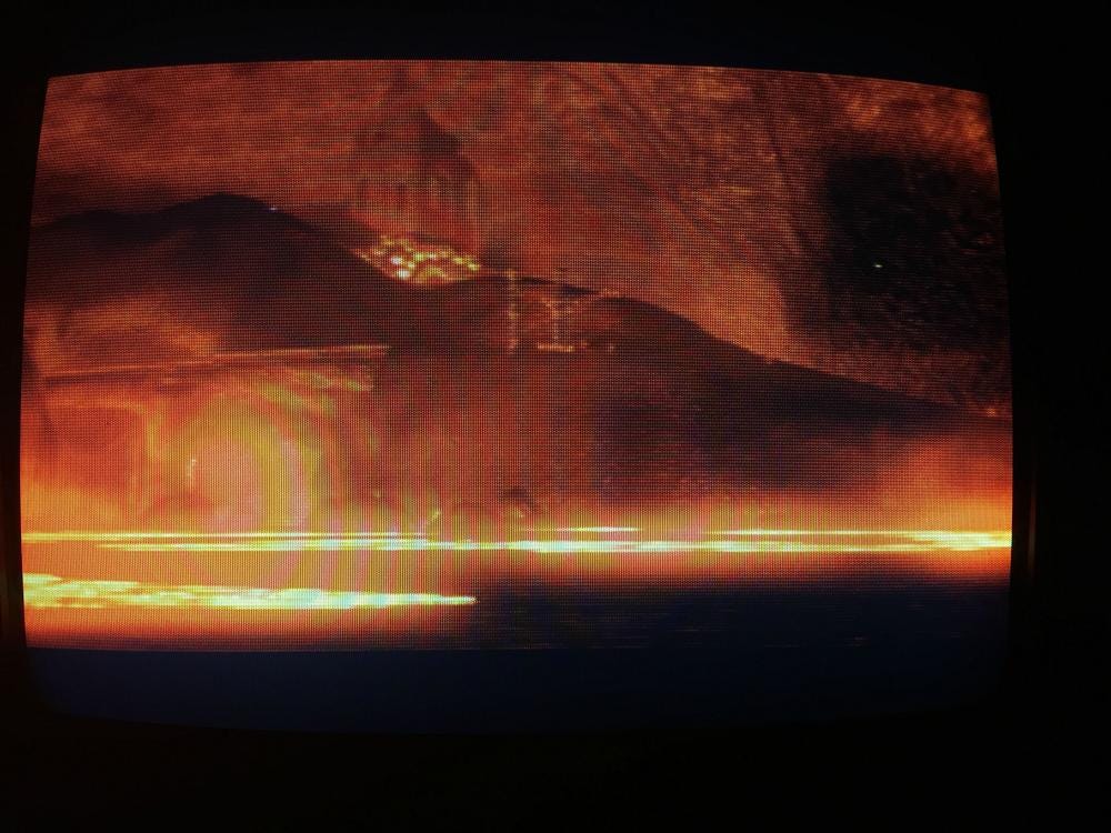
But, over time, my sensibilities have shifted to greater inclusion, sometimes just to allow a bigger-picture view of Dark Souls. Surely Lost Izalith is not in total a highlight; yet just as surely would it enliven conversation to have commentary on it exceed readymade snubs about how — yawn — it is “unfinished.” Ten years later, I still remember first penetrating the groaning, glowing Demon Ruins, and how such was the game’s power over my psychology that, unnerved, I retreated. Today, what strikes me is a lower route, opened by felling Ceaseless Discharge and cooling a lake of lava. Down a slope we go — and suddenly the land flatly expands in almost every direction before us with outstanding extent, shimmering here and there with molten residue. In the far steamy distance, a pack of bullish Taurus Demons can be barely discerned. That I know the possibilities for navigation matters little; far more potent is the subjunctive effect, the planting in the mind of what could be. Here, right here, just for a minute, Hell is a gross wonderland of indefinite boundaries to be run through with eyes widened and heart excitedly thrumming.
Lower Undead Burg: High Wall Preceding the Depths
How often would the lower Undead Burg make it onto people’s Top 5, or even Top 10, Dark Souls Areas? Has it ever? Why would it? I love every bit of this location: from how you enter — sliding down one of the game’s longest ladders, and essentially coming in from a backside; to the intensifying abundance of ivy and the emergence of grass and other little plants past a decline; to the curving dead-end passage near the entrance, lined by torch-wielding Hollows, and falling into pitch blackness on the iron-fenced side; to the tiny one-room interiors inhabited by hooded rogues waiting to ambush us; to the burst of green, gold, and red colors next to a mass of burning rubbish; to the sense that, behind all the dark and tiny windows, there may be watchful eyes, and certainly innumerable unexplorable residences; to the reuse of the upper Burg’s buildings, their foundations now turned into a supervisional gorge.
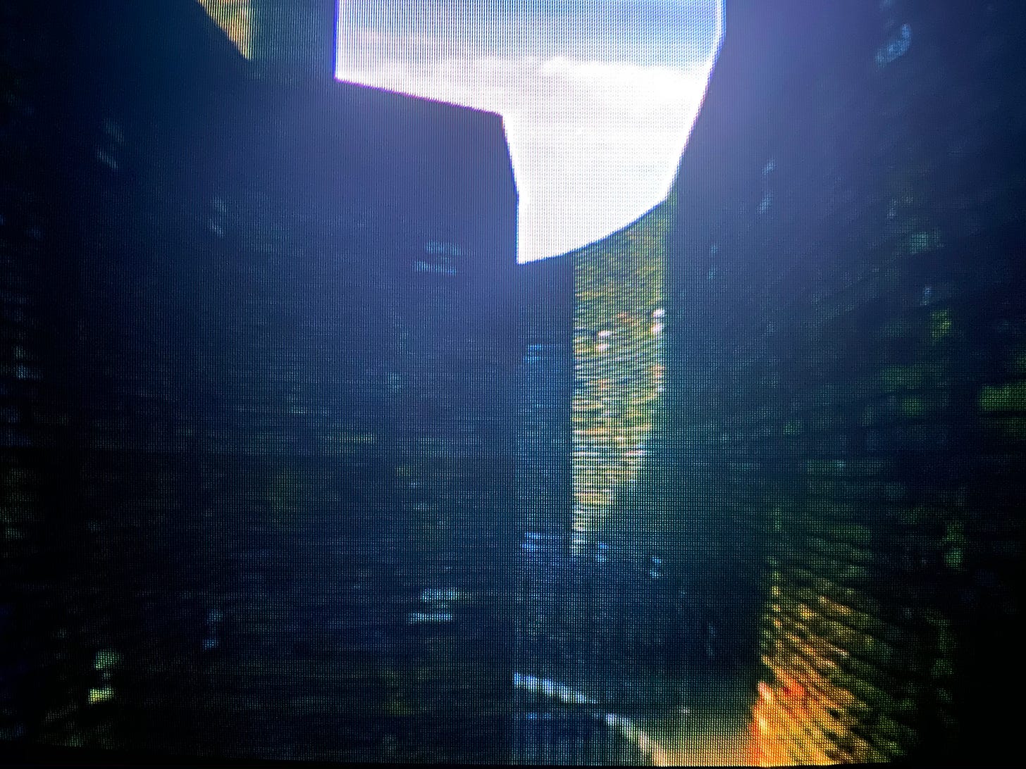
The example I’ve settled on reinforces this in-the-gorge effect. A little ways past the Capra Demon’s enclosure, we round a bend, a double staircase on our left leading to a rotunda, and to our right a massive outward-curving wall featuring a sconce-framed door, which will lead to the Depths. Tantalizingly, frustratingly, the path we are on, if we are to keep following it, ends similarly to a detail from Blighttown: iron bars and a corpse on the other side (here bearing a forgettable bauble). The bars, it would seem, were hastily inserted later to halt circulation. Unlike Blighttown, the path’s continuity is not obscured by darkness but rather its thinning movement around a leftward bend. The walls on our sides reach up and up. With blunt force, they stress the burg’s fortifying functions, and to me recall the neo-medieval spaces of Ezra Stiles and Morse colleges at Yale, somewhat critically but accurately described by Charles Jencks as “homogeneous and scaleless.” Brute enormity is contrasted with high linear specificity, that of the constricting pathway, and emotionally molded by surfaces’ broad concavity and convexity.
The Depths: Butchers’ Storage Room
The Depths are most well-known — notorious — for their introduction of Basilisks, whose petrifying breath, if fatally inhaled, halves players’ lifebars permanently — an effect only reversible with the use of one consumable, or the obscure services of one far-flung character. I too remember the Depths for that, but more so, and maybe most of all, for their curious and perverse semblance of domesticity near their beginning. We find a square-columned floor occupied by several Hollows, roughly furnished with tables and benches for dining. On the level right beneath, a fire and cauldrons are set in a pair of arched recesses. Two hairless dogs stand watch. Further back is a butcher block laid with meat, lit by a single candle, and tended to by a gruesome butcher. For all the thematic prevalence of consumption in the Dark Souls trilogy, it is rare to see foodstuffs or spaces set aside for eating. The scene here in the Depths, then — crude and matter of factly horrific — has a strange aspect of corporeal intimacy.
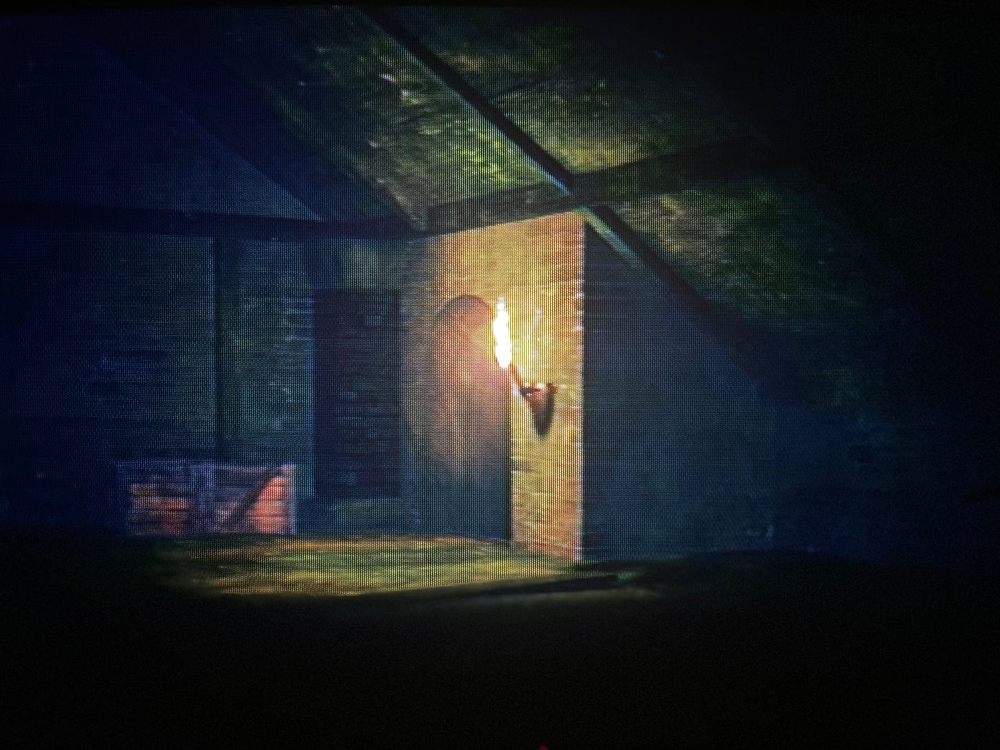
But let us move to the room next door, wherein we discover Laurentius, a pyromancer who tells us he was captured for food, and who has been stuffed — dare we be so rude? — somewhat comically upright into a barrel for safekeeping. As for the room itself, a half-timber hall lit by a single sconce, the theme of domesticity continues with understated bizarreness. Despite our person being by now several levels underground, the hall’s ceiling matches the roof-shape of some old farm house or threshing barn, built of wood and steeply pitched, almost meeting with the floor on one side. It is a design of practical origin with no apparent practical function here. As such, it gives me the impression of a sunken rustic architecture, as if a terrestrial hall were transplanted, drag-and-dropped, into the earth. Is this nonsensicality? Who cares? It’s interesting and unique — and, abductee aside, even a bit cozy.
Firelink Shrine: Aqueduct Bridge
When writing on Demon’s Souls two years ago, I remarked upon its contextual mechanic whereby your person can mount a higher tier if they continue walking against the designated rise in terrain, in addition to the game’s drastically slight fall damage; and that these details, together, amplified one’s sense of exploratory possibilities. “This sense of possibility,” I noted, “is not proportional to what you can actually do; rather, it is about what you feel that the game might allow you to do.” It is a sentiment already mentioned when describing the example from the Demon Ruins, with reference to subjunctivity, a term the near-absolute lack of which in literature on Dark Souls is a great omission. Subjunctivity is the as-if of the imaginal, hovering about the liminal artifice of a Corinthian capital, neither raw stone nor living foliage. This is the exciting tension of Dark Souls, a rigorously composed and controlled experience which nonetheless plants and germinates the seeds of a question — what, really, is this world’s navigable extent? — by subverting expectations, here and there, of where we may go and how.
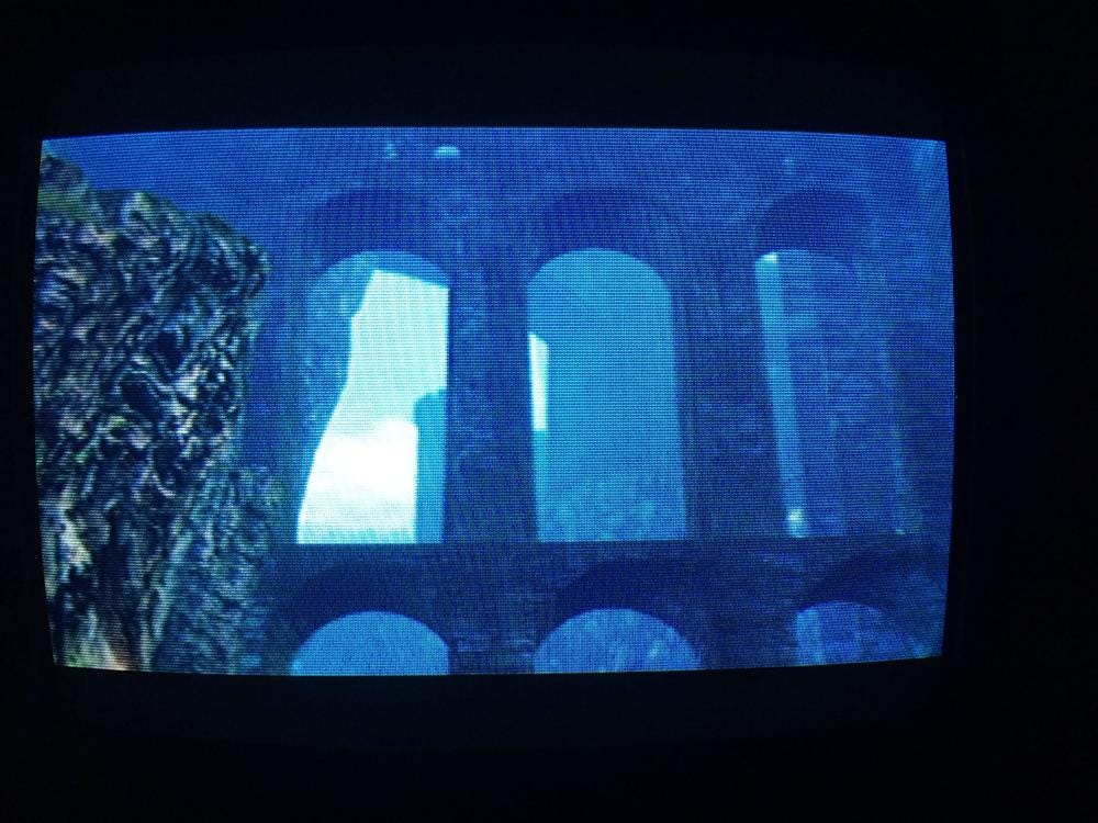
Arriving at the game’s hub, Firelink Shrine, we are straight away impressed by a variety of landmarks. One of these is an aqueduct bridge looming above a hilltop. It turns out that the aqueduct’s water channel is our means of accessing the Undead Burg — an oddity in itself. Odder than that: if we are adventurous enough, we may find that the aqueduct’s lower tier, where an item-bearing corpse rests, can be leapt onto. This is a piece of level design which seems, judging by sight alone, to be unnavigable. Indeed, while making our way around each of the piers, our person’s feet are only half on the ground! Among the grander scheme of things, the acquired item’s value pales in comparison to the bridge and its suggestion of future possibilities, its encouragement of observational double takes, of risk-taking. The countless bloodstains spotting the edges of cliffs, recording players’ fatal leaps and plummets, are a collective testament to people’s compulsion to find what might not—– and often does not! — exist.
What finally makes the aqueduct so memorable for me is that a character, the merchant Domhnall of Zena, later takes up residence there beside the corpse. The eccentricity of this occupation speaks to the eccentricity of its occupier, but it also recalls persons’ improvised residencies among Demon’s Souls‘ hub, the Nexus. “There is something,” I wrote elsewhere, “about how the ‘arbitrariness’ of [these persons’] situating in corners or on ledges, goldenly lit by candles or lanterns, activates the architecture as appropriational space and speaks to its existence as a structure uninterested in catering to domestic needs.” Put another way, Domhnall’s latter habitation illustrates architecture’s multivalence and the sobering fact that, in Lordran, home — if such a word can be used — tends to simply be the place where there is a space between oneself and others. Domhnall, by his own admission, “didn’t expect to meet anybody here.” Even this chipper, curio-seeking merchant would appear to have his hermitic side. What spot would we choose for ourselves? Would it necessarily be where the most characters or online players are? It’s a question worth considering, for it may be psychologically revealing.


