Lithic Lacks & Chromatic Apologia ║ Elden Ring
Critically contextualizing Elden Ring's palettes through a history of polychromy

When, in his influential paper, “William Butterfield, or the Glory of Ugliness”, historian John Summerson characterized architect William Butterfield as at once a formal sadist and a naif, a sort of creatively brutal and crude puer aeternus, he was inventing a person who never existed to suit his inclinations and thesis. An exploration of Butterfield’s own professional correspondences make it abundantly clear that his aim was never the triggering of societal unease through architectural insinuations, even if it is equally clear that Butterfield’s profession was, in part, an expression of his stake in the religious-revival competition between the Evangelical and Oxford Movements. Rather, Butterfield’s wording herein makes use of terms like “remarkably pretty”, “gay”, “quiet order, completeness, and proportion” — words which point to a deep concern for considerate visual sensuousness.
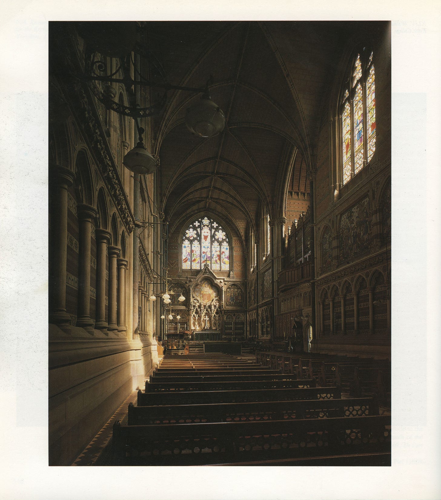
But it is also true that contemporary receptions to Butterfield’s work, which increasingly made use of structural polychromy — that is, the use of different and alternately constituted materials for color, rather than the usage of paints — varied throughout his lifetime. It would probably come as a surprise to many readers that even the application of pure red brick in the mid-nineteenth century was considered daring. As an author for The Ecclesiologist wrote, with typical fine-worded aggression: “we do abhor [brick], whether black, red or white, most cordially.” A local critic in The Building News pejoratively described the exterior walls of Butterfield’s Balliol Chapel as looking “like slices of streaky bacon”, and it may perhaps amaze readers most of all to know that, for a long while, standard Oxford opinion considered the architect’s chapel at Keble College “the ugliest building in the world.”
Considering these matters, sociologist and oral historian Paul Thompson writes,
Such responses reveal the continuing hold, even in criticism of the Gothic Revival, of classical instincts; of the divinity of whiteness proclaimed by Alberti, Palladio and the theorists of the Renaissance. Their belief in colourlessness was none the less powerful for being in conflict with most previous architectural tradition . . .
As it turned out, the “divinity of whiteness” has always been an error of interpretation, quite naturally explicated by Hegel’s objectifying of history as a slaughter-bench. Information doesn’t want to be free; it wants to disappear. It is only a matter of time until those things once considered so permanent as to be categorized by a culture as immortal are lost through negligence, war, natural disaster. The earth is a massive cemetery, each generation built upon the bones of the last. Paintwork on structures exposed to the elements for hundreds, or thousands, of years will be one of the first things to go on that slaughter-bench. Colorful today; blanched tomorrow.1
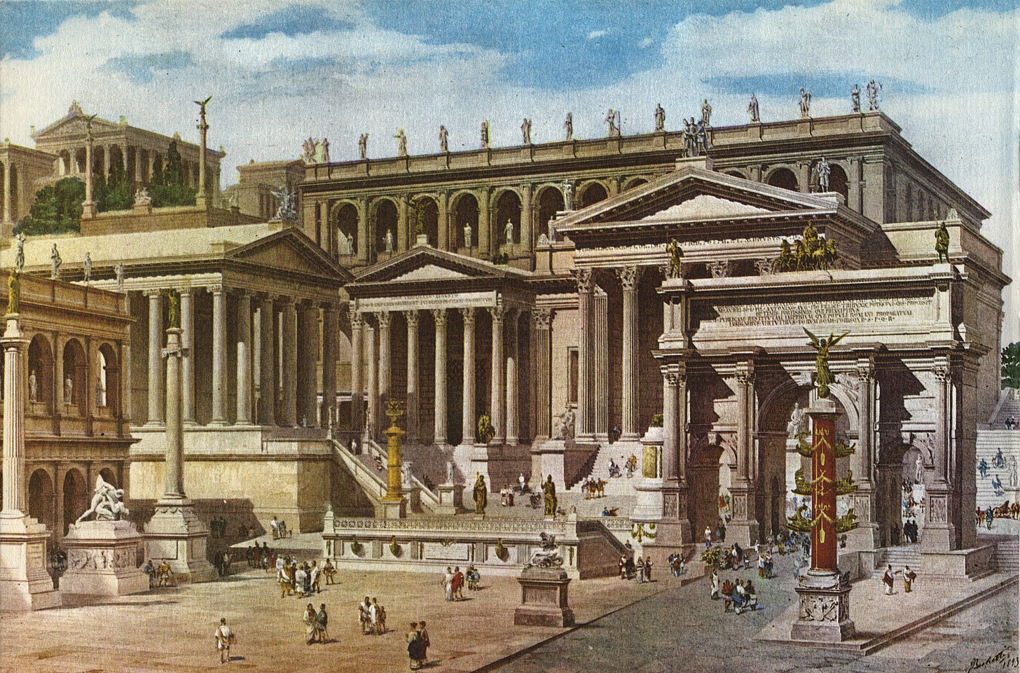
The first indications that Greco-Roman architecture and sculptures were not always ivory-colored masses, but had instead originally been painted upon, came from Germany during the early-nineteenth century, with the argument for applied color as historically accurate and desirable being led by persons such as Gottfried Semper.2 Semper’s case was always an uphill, or upmountain, battle against prevailing ideology — to the extent that, as buildings of neoclassical design continued to be built during the twentieth century, and are occasionally built this century, one must rather look to so-called postmodern classicism for vivid coloration.3 Classicism and neoclassicism have pretty firmly settled into our heads as bone-white or grayish.
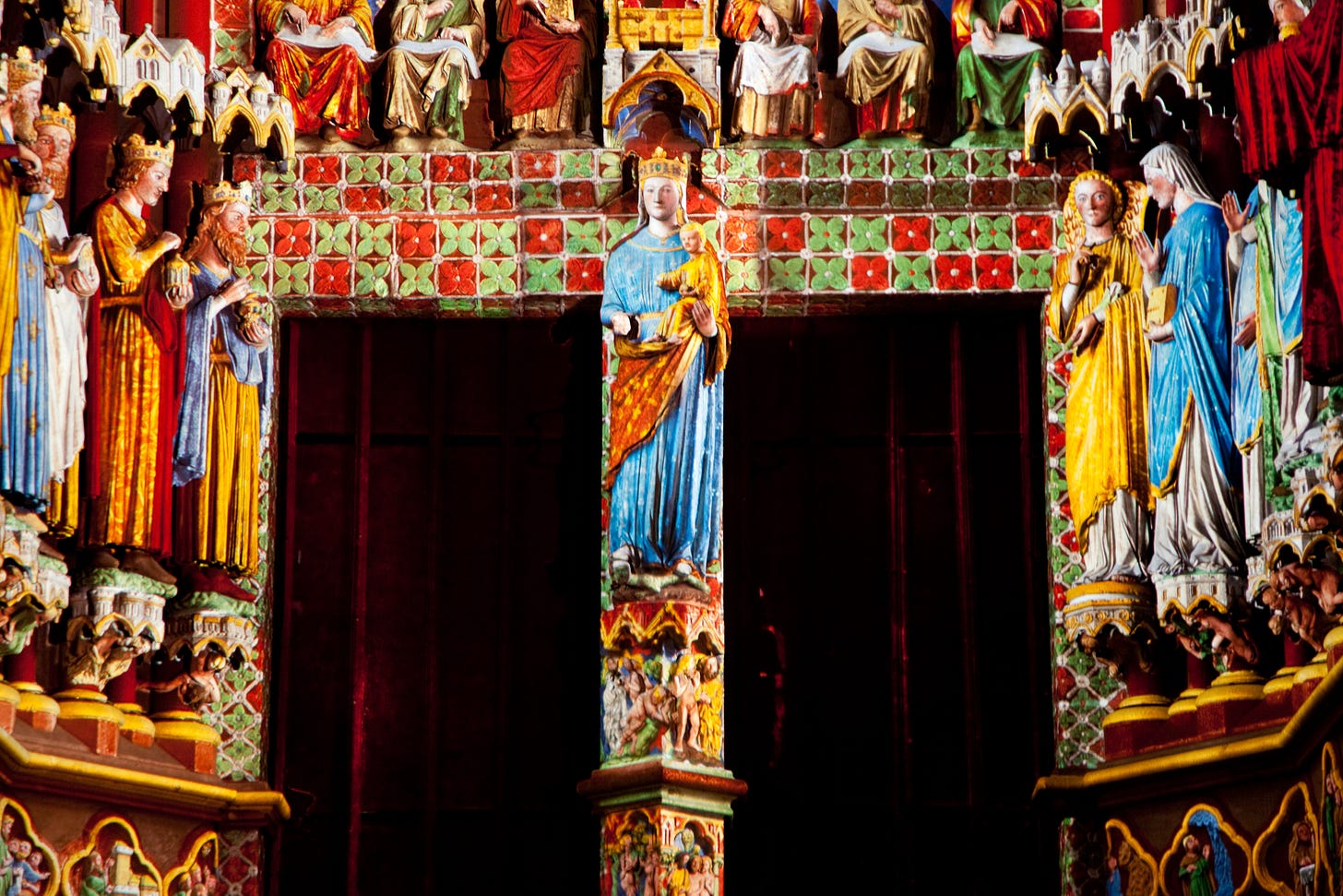
The same is true of what was, for a while, called Pointed architecture. Today, we refer to it with the term once used for its denigration: Gothic. As far as popular imagination is still concerned, the cathedrals of old strictly derived their brighter colors from daylight filtering through stained glass windows. This is no doubt partly due to the influence and popularity of “Gothic” as a gloom-loving literary genre, although it is absolutely true that countless Early-English churches, for example, are comprised of all-somber colors, and ever were. But Butterfield’s polychromy, to a certain extent, was the result of his own discoveries of local and international precedents (as well as selective applications of John Ruskin and August Welby Northmore Pugin’s writings), at the time largely unknown by the English populace, even as his architecture later on trended towards a more non-historical eclecticism.

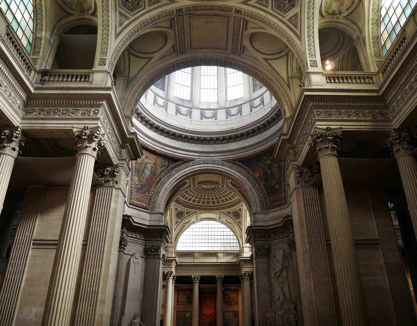
Nor did the aforementioned “divinity of whiteness” have total application. Its predominance tends to belong more to the time of neoclassicism proper, when a building such as the Parisian church of Ste-Geneviève, a.k.a. the Panthéon, was first going up. Here, exterior and interior possess the immaculate specific crispness of French sculptural technique and an exquisite, bare-boned coldness. It is astonishing to compare this interior to that of the Basilica of St. Mary of the Angels and of the Martyrs, the majority of which was built to the designs of Michelangelo, begun approximately two-hundred years before the Panthéon. Both of these buildings are obviously “classical” according to the broad parameters for that term, yet there is a bounty of differences, perhaps the most obvious of these being interior coloration. Whereas the Panthéon reserves its non-neutral coloration for murals, colors are strapped to the basilica’s interior like enormous candied slabs, with the apse’s trompe l'oeill lending a striking burst of greens and golds to the mix.

One could also compare the Panthéon to its Roman namesake, the interior to which is an outstanding example of ancient structural polychromy, and was an enormous source of inspiration for Renaissance architects. Certainly this was a point of reference for Raphael when designing the basilica Santa Maria del Popolo’s Chigi Chapel: an amazing exercise in sumptuous structural polychromy, never to be done justice with photographs. From the portasanta marble balustrade, to the revetments of verde antique, to the giallo antico for the pyramids’ bases’ mouldings, the chapel is a no-expenses-spared demonstration of the chromatic variety achievable through stone alone — an unforgettable feast for the eyes. Just as remarkable in its own way is the Cybo Chapel, also a part of the basilica, and designed by Carlo Fontana with equal respect paid to the natural and diverse coloristic qualities of stone.
Perhaps the last great hurrah of structural polychromy executed on a grand scale with brick was Westminster Cathedral, begun 1895, unfinished to this day. Its architect, John Francis Bentley, evinced a self-determination alike Butterfield’s when, in 1889 — by then, most applied dedicatees of structural polychromy had moved on or decided against it — he wrote that “in matters affecting work I don’t change much. Twenty-five years and more ago I came to pretty strong conclusions and I don’t think the moving fashions of the day produce any impressions on me now.” Bentley’s conviction here encountered a sort of pushback during the building process: as architect and author Alexander Stuart Gray noted, “Fourteen million bricks were used and the monotony of the work led to a strike of bricklayers.”
Of course, these comparisons comprise their own range of considerations modified by the details of time, place, architects, architectural purpose, and so on. Turning our attention to the exterior of the Pueblan Temple of San Francisco Acatepec, we are met with a kaleidoscope of reds, yellows, blues, and greens quite alien to our usual associations with baroque buildings. We might sooner compare it to the Cathedral of Vasily the Blessed than anything of Italian origin. In another (literal and figurative) area, Matthias Church, Basel Minster, and St. Stephen's Cathedral exhibit the impact of color when used highly selectively, with each’s brilliantly colored and broadly patterned rooftops contrasted against a bulk of severe stonework.
The pleasure of such a contrast is expressed in a different way by Cardiff Castle, most notably transformed during the nineteenth century’s Gothic revivalist efforts, such that its very dully-colored exteriors give no indication of its interiors, bedecked and painted according to the designs of architect William Burges, so richly wrought and spangled that one can hardly believe it was achieved. Taste will perhaps continue to dictate whether or not one finds these alterations delightful or cloying. The same could be said of another of Burges’ projects, the elephantine Castell Coch. In a slightly alternate vein is Boston’s Trinity Church, with an exterior vastly more ornate than the aforementioned pseudo-castles — an exemplar of Lewis Mumford’s characterization of a period in post-American Civil War architecture having a decidedly autumnal quality — and giving no indication of its splendid interior, overflowing with warm colors, so different from the outside that one feels as if, upon entering, they have uncovered another realm of the world altogether.

Just as my comparison between the Panthéon and Santa Maria degli Angeli was made not with the intent of proving one better than the other, it is worth saying that, of course, whitish and grayish architecture is its own domain of tonal ranges, formal emphases, and relative artistic advantages. It would be ridiculous to condemn black and white photography for lacking color, and equally ridiculous to deny that — structural polychromy aside — paintwork over materials possessing their own native colors and textural aspects is, even in the best case, both a gain and a loss. Coloristic restraint, mild or extreme, clearly has its own aesthetic validity and powers.
It’s via this microscopic history of color and architecture, with a deliberately European focus, that I want to now look at Elden Ring: developer FromSoftware’s most colorful, yet perhaps its also most colorfully disappointing, release molded upon Demon’s Souls. Although the general undue reception to Elden Ring’s overworld as being unprecedented seems to have been largely a result of the combination of developer prestige, salable keywords, and the amnesic effect of the “hype machine”, it is evident that FromSoftware took its first foray into so-called open-world design as a chance to imbue landscapes with a variety of color unseen in its comparable titles, and fairly unusual for contemporary titles of this scope, cost, and profile.
It is probably not an exaggeration to claim that the majority of the most notable instances of Elden Ring’s visual direction directly involve color. If the daunting strangeness of the giant monster Astel is amplified by its iridescent wings and multicolored globular masses atop its back, becoming its tail, then the glory of coming to the Altus Plateau is surely the sight of its orange-leafed trees, yellowing grasses, and golden-clouded sky. The moments when Elden Ring’s world feels most alive, full of a delicious vitality approaching the sensually erotic, are moments of the most generous polychromy: as when, galloping atop your steed along a path at night, glowing golden pollen and petals swirl about you, stone lamps spotting the way, a cobalt sky lightly sugared with azure stars, minor Erdtrees in the far distance, their leaves explosively alit in a pale gold; a night patrol ahead, torches illuminating regalia; and, swaying and bobbing on the hills — amber-leafed trees, olive-green bushes, flowers with petals of faded orange, burning red, muted violet.
Why, then, are Elden Ring’s colors for its architecture so homogenous, so apparently unwilling to go beyond vast swathes of grays, creams, and browns? This is a question I never once asked about Demon’s Souls, the Dark Souls trilogy, Bloodborne, or Sekiro; but I think I am asking here partly because Elden Ring’s opening up of certain chromatic doors heightens the fact of their closure elsewhere, while its size further stresses this sort of visual quarantining. Perhaps this general uniformity strengthens the game as taking place on a single landmass; but is not fragmentation one of Elden Ring’s most central thematics? Why isn’t this a world where the shifts, some dramatic, of climate, flora, and fauna, and even sky — as when the flax-cyan yonder of Northern Limgrave, similar to that of The Elder Scroll IV: Oblivion’s Mania region of the Shivering Isles, transforms to a raging red within the lands of Caelid — are matched by notable shifts in the color of geology and architectural materials? Why are there so many crags, cliffsides, and fractures, but no instances of polychromatic lithostrata?

It is genuinely difficult to think of instances in Elden Ring where native color, as separate from ambient lighting, seems to be used to the advantage of enhancing the — to use a much-beloved Victorian term — character of architecture. Perhaps the two exceptions, which slightly recall the examples of Matthias Church et al, are Stormveil Castle and Leyndell, Royal Capital, which respectively cap their structural upper limits with ochres and gold. Stormveil Castle may be the more striking of the two in this respect, if only because its general arrangement is more obviously hierarchical, thus giving its higher regions more effect, and because its encrustations are of a bizarre pseudo-Gothic invention, almost resembling the blockiness of Minecraft assemblages, unlike anything FromSoftware’s artists have attempted before.
Outside of these two examples, one is forced to sift through heaps of sand to find but a few precious bits of sea glass. The subterranean city of Nokron has selective portions which, if one is paying close attention, sport a faint variety of greens in the archivolts, panels (alternating with bronze and bordeaux), and string courses’ running ornament. Select interiors at Leyndell have a pleasant interplay between the chalky architectural elements of stone and those built of dark wood and highlighted by gold carvings. And, minute as it is, Elphael’s rot-flooded chamber, above Malenia, does register somewhat, where the stonework’s bulk is toned the slightest pastel pink.
What else? I’m not sure. On the opposite end of things, it could be said that the sun-blasted bony exteriors of Farum Azula and the fanciful soap-white webwork of the Haligtree’s arboreal town — obviously and amusingly based on illustrator Alan Lee’s renderings of Rivendell and Lothlorien from The Lord of the Rings — represent their own kind of visual notability within relative colorlessness.
Some of Elden Ring’s decisions concerning its fortresses, from Castle Morne, to Fort Faroth, to the Shaded Castle, may be explicable as an adherence to certain precedents set by actual fortresses — but the reduction of that typology here to grayish masses, all with the same sort of materials and stonework, seems to represent its own meagerness of vision. What of the brick diapering of Malbork Castle? Or the cookies-and-cream banding of whitestone and black slate on Château d'Angers’s keep?
Is it possible that keeping most of the architecture within the same coloristic range was done in order to make it distinct from vegetation? In practice, this is fairly effective, although puzzling, since it seems to represent an extreme end of the clarifying methods FromSoftware have historically used to maintain expressivity and legibility; and, in any case, the most effective method of demarcating the location of architecture in Elden Ring is the Weltlandschaft-like isolation of structures, and/or their relative predominance as vertical masses. Color is not an essential part of the signaling effect here, and players have a map with built sites marked on it — plus beacons, which can be applied for in-game directional guidance — to consult besides.

Beyond faltering imaginations or techniques for visual emphasis, I find it entirely possible that this homogeneity is yet another consequence of Elden Ring’s scale, which, for reasons of efficiency during its development, prompted FromSoftware to not tend so much to the specific colorations of places and to instead coat them in palettes which, inside and out, were “justifiably” or “identifiably” architectural. This is at once a very sensible decision of economy, were it the one made, and one which, I think, indicts the ongoing push for videogames to be of a certain size in order to be considered significant — an arbitration tying into the poisonous but standard conflation of time sunk with the positive values of a work.
Whatever case or explanations there are to be made for Elden Ring’s archichromatic homogeneity, the issue is hardly helped by certain technical decisions: strong contrasts/dark shadows are typically out of the picture, fog effects are overused, and FromSoftware’s characteristically odd lighting — re-standardized with the company’s entry into development for the PlayStation 44 — tends to give many surfaces here a flat metallic sheen, even when the surface may be dirt at daytime. A number of mods (like these two) illustrate that at least a minority of people find this grayness to be an issue pervading the whole game, echoing some occasional criticisms of Skyrim which similarly found partial rectifying through mods. Put together, these details frequently burden Elden Ring with something of the appearance of clumps of clay indistinctly pushed together. The Academy of Raya Lucaria, already a bathetic non-entity of level design, becomes quite possibly the game’s dullest location with its mercurial coating, only barely alleviated by the effect of interiors’ warmer lighting schemes.
Frankly, much of Elden Ring resembles a work which has yet to receive its complete coloration, and is perpetually saddled with catch-all placeholders. The 2016 release Dark Souls 3 had this problem in a number of places too — the Catacombs of Carthus and their repeat within the Smouldering Lake come to mind — yet I can also think of a variety of sites and setpieces there which, were they in Elden Ring, would probably have been dunked in a pool of lifeless grays, such as the Profaned Capital’s columnar groupings, Farron Keep’s semicircular towers, or the facework of Archdragon Peak’s Byzantine complex. Elden Ring also often subjects the player to rain5, either due to the climate or the game’s programmed whims. Rather than excitingly darkening the landscape or drawing out the satiated verdure's vibrancy, these rain showers just trade out more of the world’s color for paltry drizzles and additional mid-range grays.
Since Dark Souls 2’s 2014 release, there have been numerous attempts by audiences to approximate what the game appeared it would look like upon the first revealing of in-game footage, prior to developmental issues necessitating a sweeping overhaul whereupon Yui Tanimura assumed central leadership as director over Tomohiro Shibuya.6 I bring this example up not only because it is interesting that less than ten minutes of footage have sustained, for years, the imaginations of people who found the eventual production lacking, nor only because it shows how what is imagined can be infinitely more exciting to reflect upon than the actual7 — therein lies the appeal of subjunctivity — but also because it typifies how all criticism of the disapproving sort is both compensation and compromise: an attempt to reveal to others what one would prefer to be the state of this or that thing, despite all otherwise aspects, despite some final regardless reality. Perhaps one day modders will figure out a way, and decide, to give Dark Souls 2 an all-inclusive surgical makeover of its areas’ very structure. Until then, and no matter lighting effect upgrades, Aldia’s Keep will remain firmly rooted as both darkly alluring in its initially unveiled state and, as executed, one of Drangleic’s feeblest layouts. And so the same with Elden Ring and color.
One of the marks of good disapproving criticism is the attempt to negotiate with hypothetical or disclosed creative intentions vis-à-vis informed critical preference. I have attempted to do this with the topic at hand, while being aware of the risks one makes when information on intent is sparse or simply absent. Similarly, I am sure that certain narrative arguments for instances of the homogeneity could be devised, and put against, my own criticisms. Of course, narrative is yet another creative decision, and so one would have to inquire about the apparent decisions therein.
To sum up: if we are going to talk about, or even mention, Elden Ring’s palettes — while one user on the Steam forum opines, “[This] game is quite possibly the most colorful and most beautiful Fromsoft game I've ever played,” another, on Reddit, and to enormously positive response, writes (with visual accompaniment), “The color palette in Elden Ring is incredible” — and if we are willing to take into account the stunning chromatic variety European and European-derived structures have offered for centuries, I am not sure why we are excluding architecture from the picture, despite spending so much vicarious time around and inside of it.
Today, the word “aesthetic” is often used superficially to distinguish between items as one might with brands. Architect and historian Xing Ruan makes a careful correction regarding this in his recent book, Confucius’ Courtyard: “…we ought to be reminded of the root of aesthetics: ‘aesthesia’ is not just about beauty but connected with sensing — feeling and coming to life. The opposite of being alive is ‘anaesthesia’ — the dulling of the senses.” If, as I have written before, the oft-standardized designs of Elden Ring’s heaping load of minor architecture, from forts to churches to catacombs, lead to an experiential anesthetizing where a sense of discovery, of the unknown, is worn down and blunted by a recognition of the regular, I believe this is paralleled by our passive acceptance of the concomitant palettes. These aspects being combined, I cannot imagine anything more at odds with a game-type which is, in so many other areas, concerned about discrimination, about noticing things, about contemplation, and finding pleasure in the particular and peculiar.
Most later appraisals of Butterfield’s polychromy will be based on the decades-long effects of gas, soot, dust, and candle smoke on the building materials. A dazzling array of patterned effects are thus coupled with acidic discolorations, accelerating the impulse to whitewash surfaces or to reach for the interpretation of intentional ugliness.
Why persons outside of Hellas and Italy were the ones making these discoveries is not my concern here, but I would guide interested readers towards M. Christine Boyer’s book, The City of Collective Memory, for a sociopolitical explication of that matter.
See, for example, some of the buildings designed by architect John Outram.
Bloodborne, FromSoftware’s first title for the PlayStation 4, continues to stand out from the rest through its graphic usage of chromatic aberration. Some like it; others do not. I happen to think that Bloodborne’s application of it gives environments a verve and visual depth.
Elden Ring is the only one of these games to feature rain in multiple areas. The slight exceptions to this would be Dark Souls 2 — its exteriors and near surroundings for Drangleic Castle — and Sekiro’s Hirata Estate.
To this day, Tanimura continues to receive the brunt of complaints about Dark Souls 2, despite being the person who, according to available information, saved a mismanaged project, and who also co-directed the generally lauded Dark Souls 3.
A personal example of this: seeing the earliest (low quality) screenshots of The Legend of Zelda: Majora’s Mask, for the Nintendo 64 — coincidentally, a game full of bright and strange colors — when it was still unreleased and tentatively entitled Zelda Gaiden.


I think you'd find this video on the colours of Leyndell's building materials interesting: https://youtu.be/KKXvHC74xtI?si=fosTe5G3icQQcPJ-
I can't vouch for the rest of the channel, but this one is certainly relevant.